BONE FOLDER BOOKS
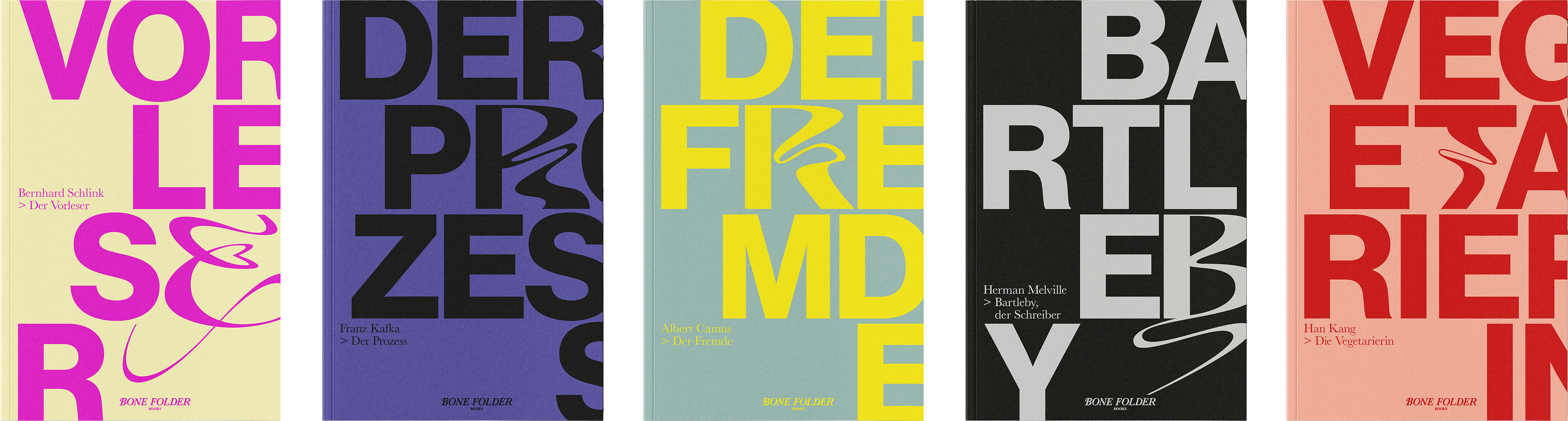
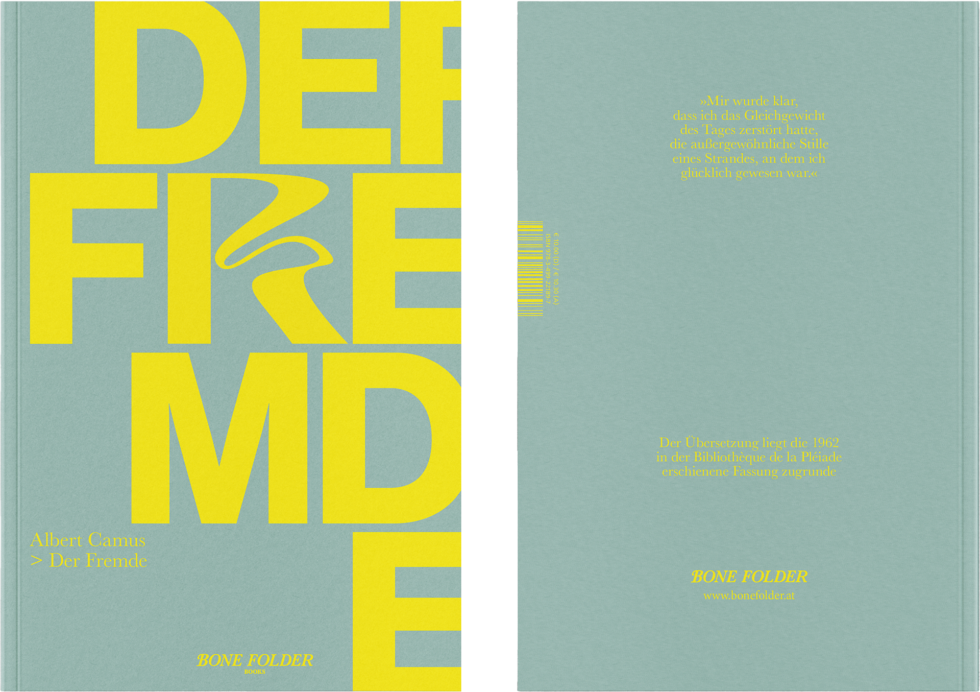
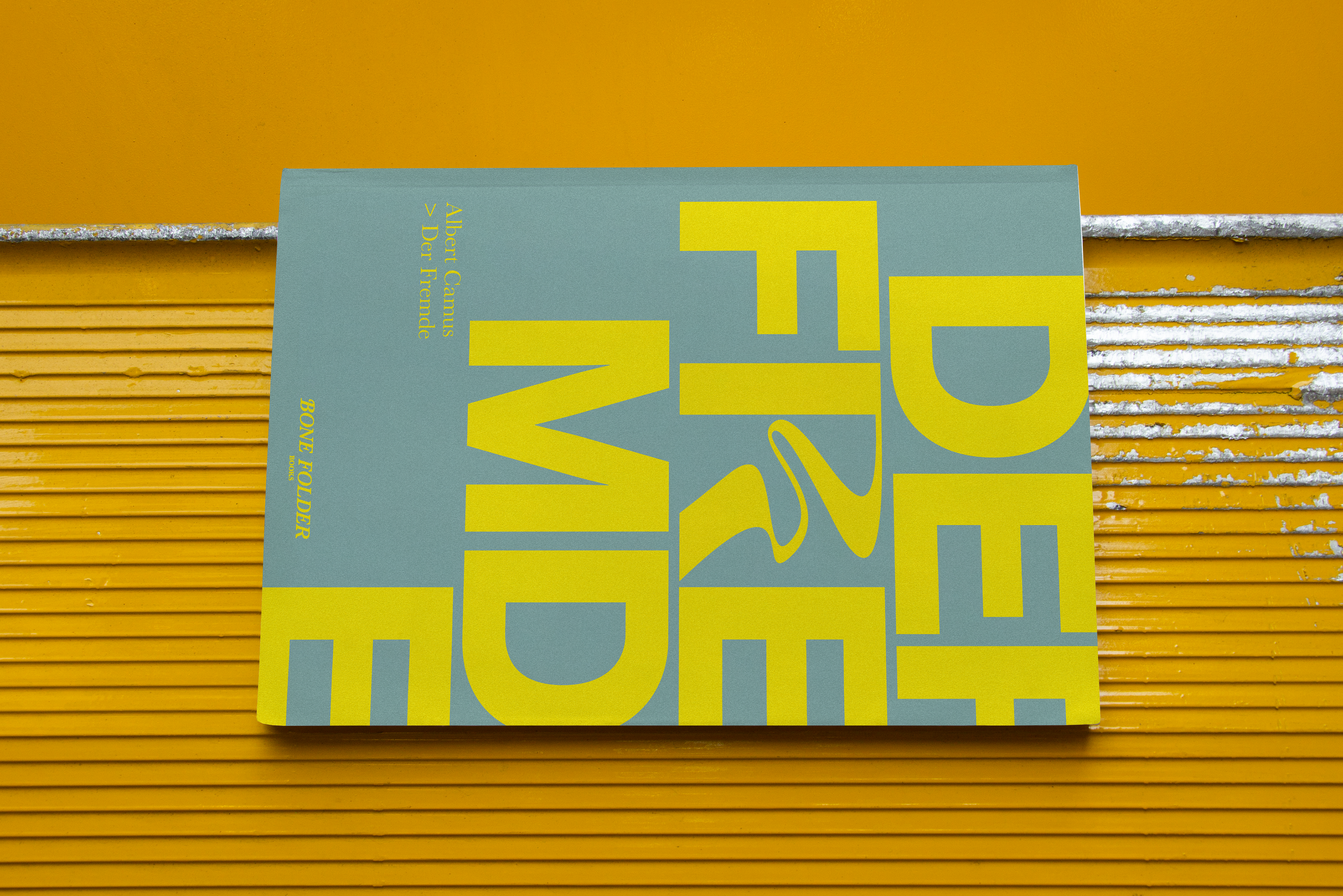
The name Bone Folder draws from traditional bookbinding tools. This tactile reference is carried through the entire brand identity, which combines precision with human touch: clean, typographic layouts contrast with expressive gestures and bold color interventions.
At the heart of the cover design system lies a conceptual typographic approach: every title features one hand-drawn, curved letter that disrupts the otherwise strict, modernist grid. This visual rupture mirrors the inner resistance of each story’s protagonist — individuals who quietly rebel, subtly unravel, or stand still in defiance.